

Prerequisites
Before using the onboarding embed, you need:- An OAuth client ID from the Cal.com team. Fill out this form to get started.
- A redirect URI registered on your OAuth client that shares the same origin (scheme + domain + port) as the page hosting the embed.
- The
@calcom/atomsReact package installed in your project.
How it works
The component opens a dialog containing an iframe that runs Cal.com’s onboarding flow. Because the iframe runs on Cal.com’s domain with a first-party session, no third-party cookies are needed. The flow automatically detects where the user is:- No session — starts at signup/login, then profile setup, calendar connection, and OAuth consent.
- Session with incomplete onboarding — resumes from where the user left off.
- Session with complete onboarding — skips straight to OAuth consent.
Two modes
The component supports two modes for receiving the authorization code:- Callback mode — provide an
onAuthorizationAllowedcallback to receive the code directly. No page navigation occurs. - Redirect mode — omit the callback and the browser navigates to your
redirectUriwith the code as a query parameter.
Callback mode
ProvideonAuthorizationAllowed to receive the authorization code directly. The dialog closes and your callback fires after the user authorizes — no page reload.
Redirect mode
OmitonAuthorizationAllowed and the browser navigates to your redirectUri after the user completes onboarding and grants access:
Props
Authorization props
If the user signs up via Google, the
user prop values are ignored — name, email, and username come from the Google account instead.Theming and custom trigger
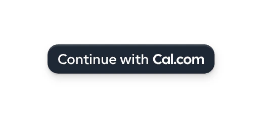
Thetheme prop controls the appearance of the trigger button, the onboarding steps, and the authorization page.
| Light theme (default) | Dark theme |
|---|---|
|  |
trigger prop:
Step-by-step walkthrough
Here is what the user sees when they click the trigger button:1
Login or signup
The dialog opens with a login form. Existing users sign in with email or Google. New users click “Create account” to sign up. The 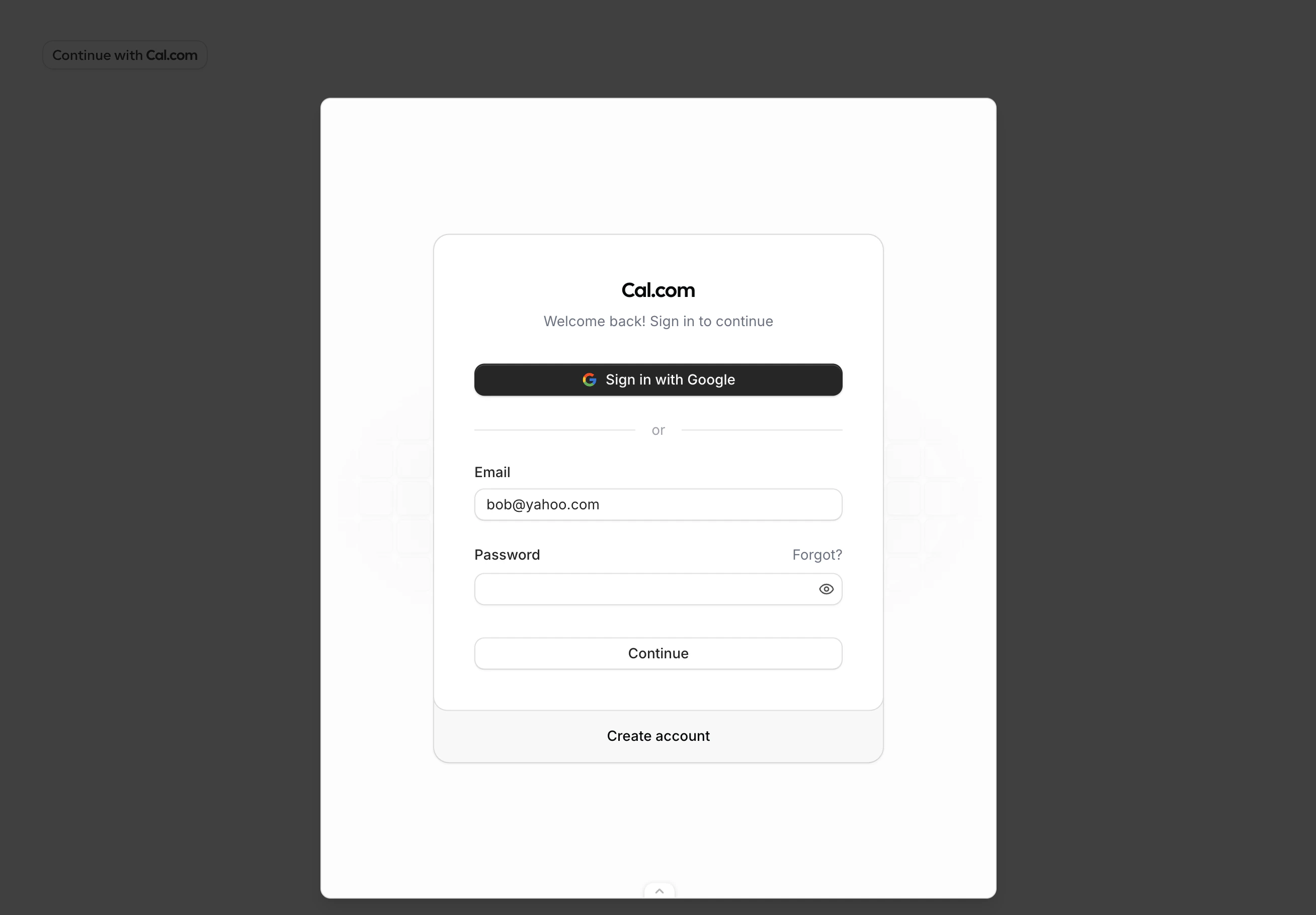
user.email prop prefills the email field.2
Profile setup
After signing up, the user sets their display name. The 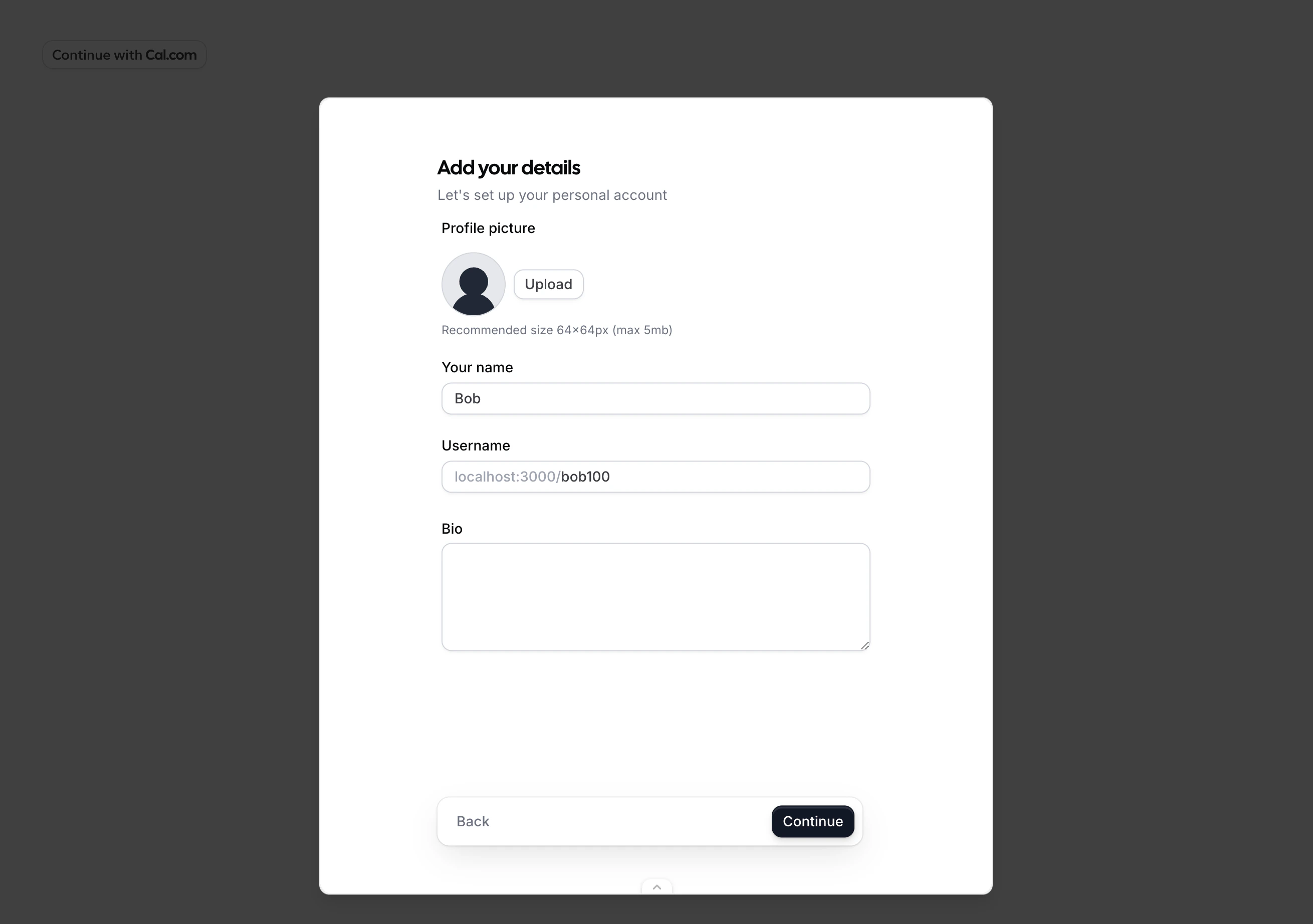
user.name prop prefills this field.3
Connect calendar
The user can connect a calendar (such as Google Calendar) or skip this step.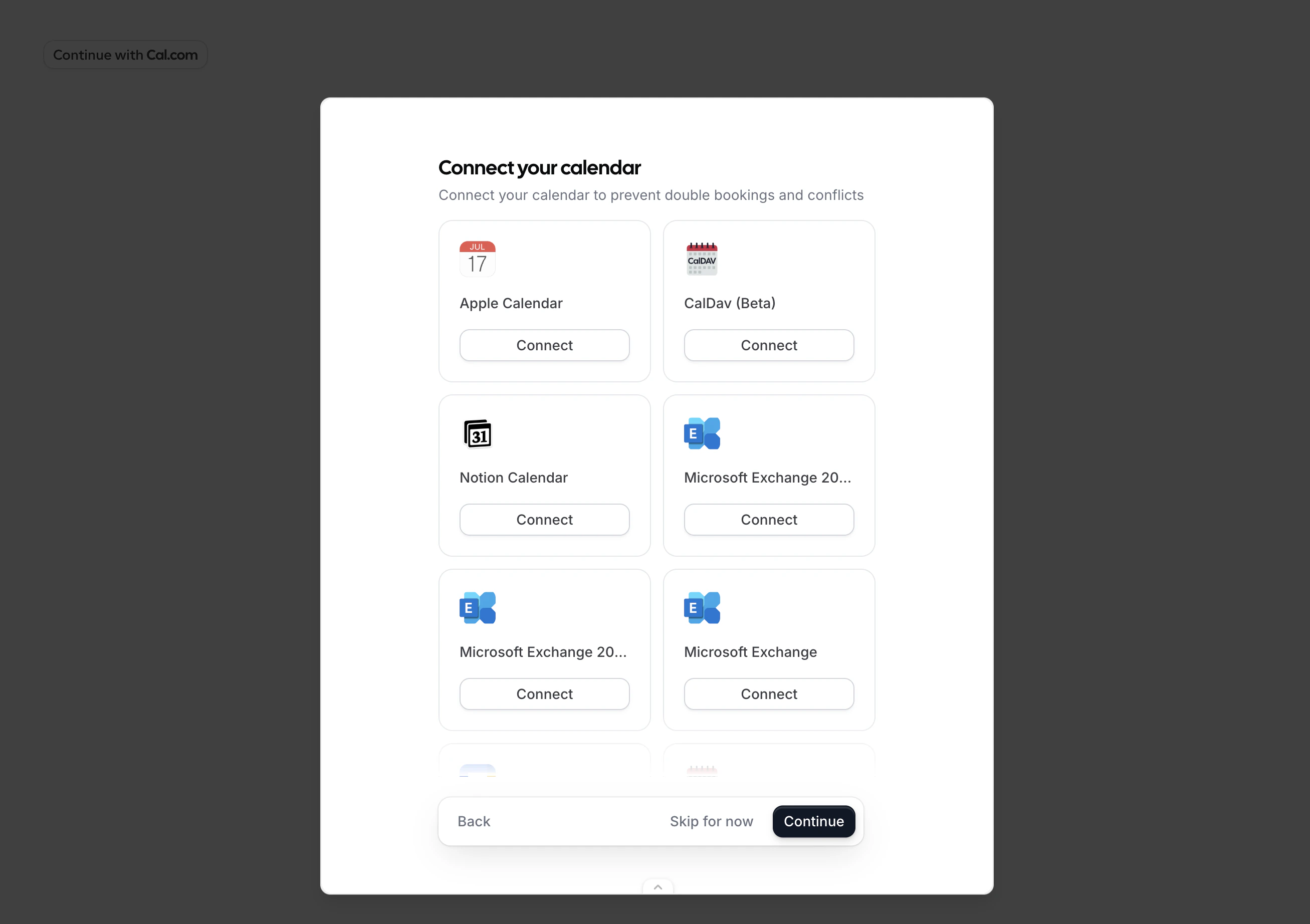
4
Authorize
The user reviews the permissions your app requests and clicks “Allow”. The displayed permissions correspond to the 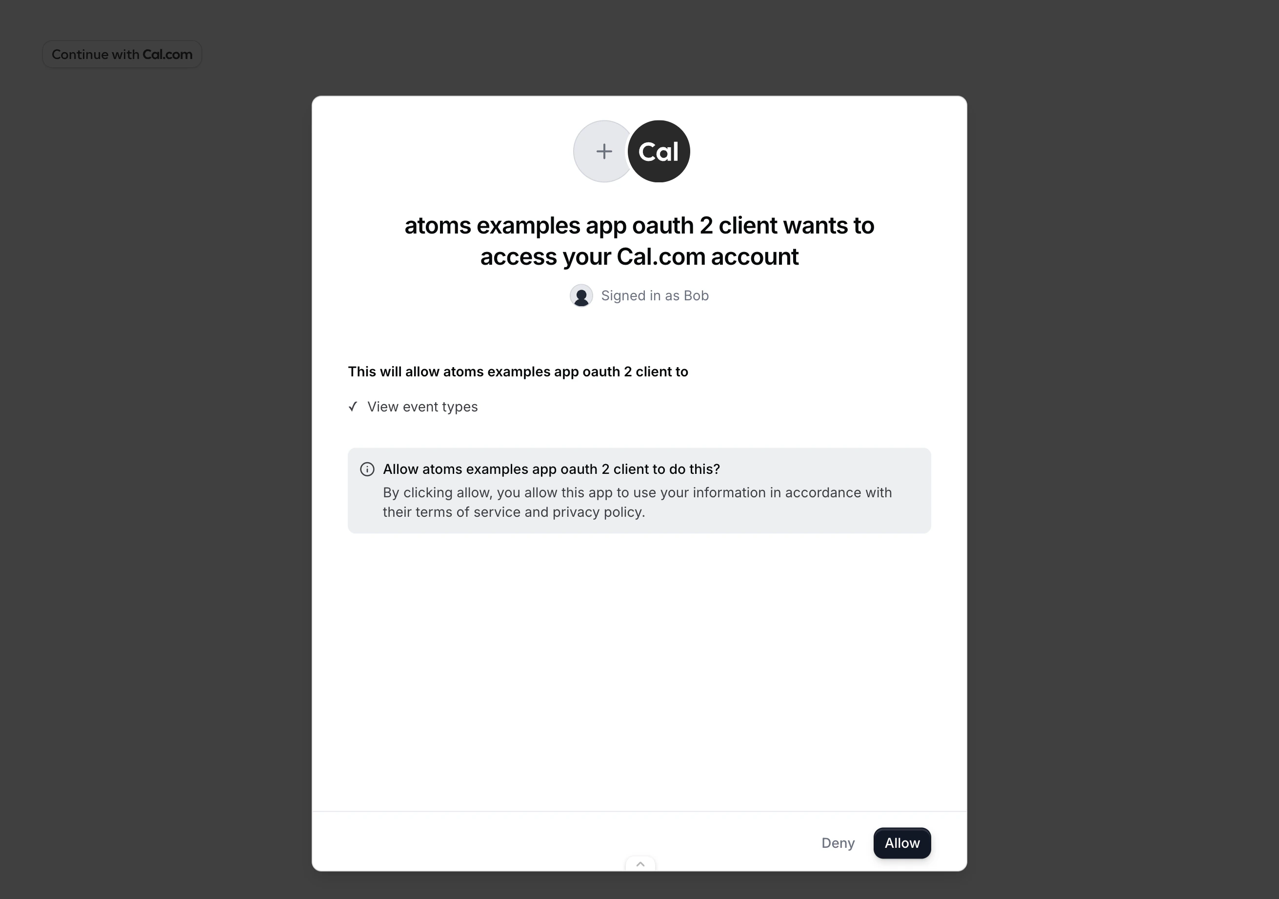
scope you passed to the component.5
Done
Your
onAuthorizationAllowed callback fires with the authorization code, or the browser redirects to your redirectUri.Public clients (PKCE)
If your OAuth client cannot safely store a client secret (for example, a browser-only app), use PKCE to secure the authorization code exchange. Generate acode_verifier, derive a code_challenge, and pass it to the component:
Error handling
TheonError callback receives an error with a code and message:
In redirect mode, errors are passed as query parameters on your
redirectUri: